Data analytics
Data analytics with Power BI
Details:
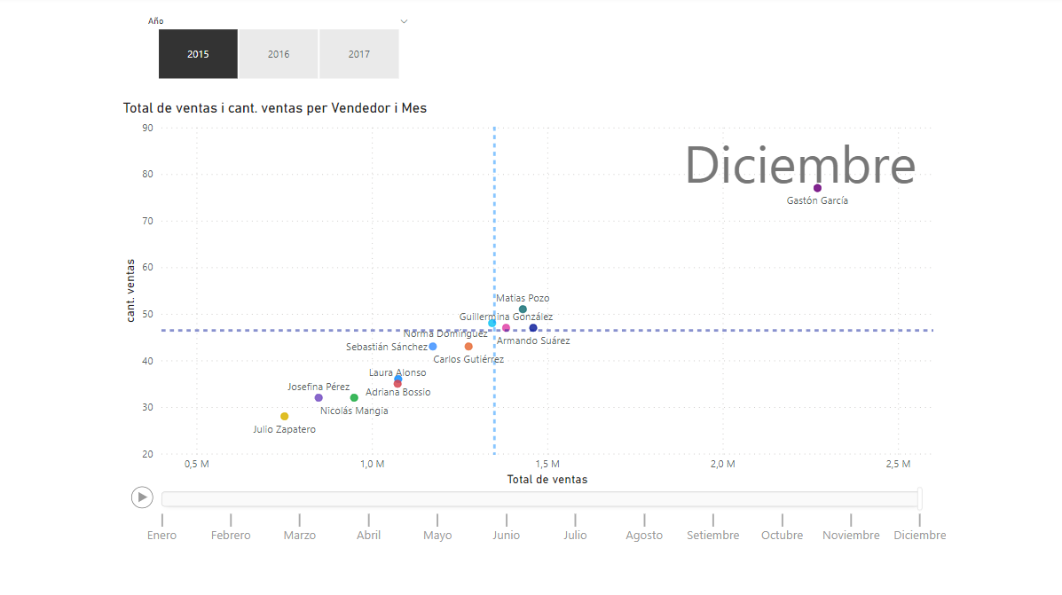
Dimensions
X-axis: Total sales
Y axis: Sales quantity
Play-axis: Month
Legend (comparison): Seller
Analytics (magnifying glass). This adds the quadrant
Average line 1: Sales amount
Average line 2: Total sales
With the play button (lower-left corner), reproduce the evolution of each month of the selected year
Chart 1 details
Dimensions
Axis: Month and year
Values: Total sales
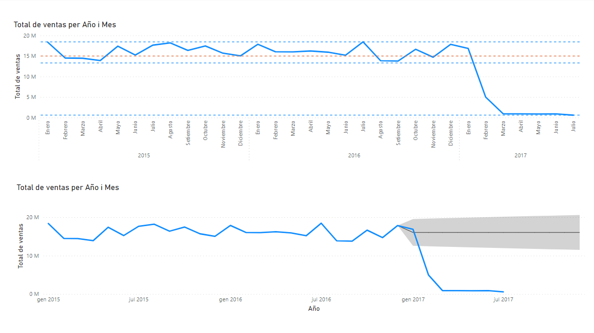
Chart 2 details
Dimensions
Axis: Month and year
Values: Total sales
Forecast
Duration of the forecast: 12 points
Ignore the last one: 7 points
Confidence interval: 95%
Confidence band style: Fill
Transparency: 80%
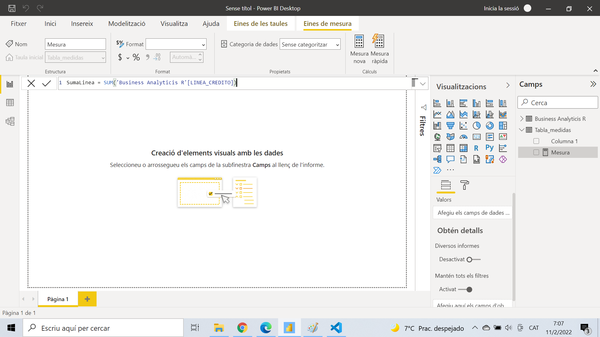
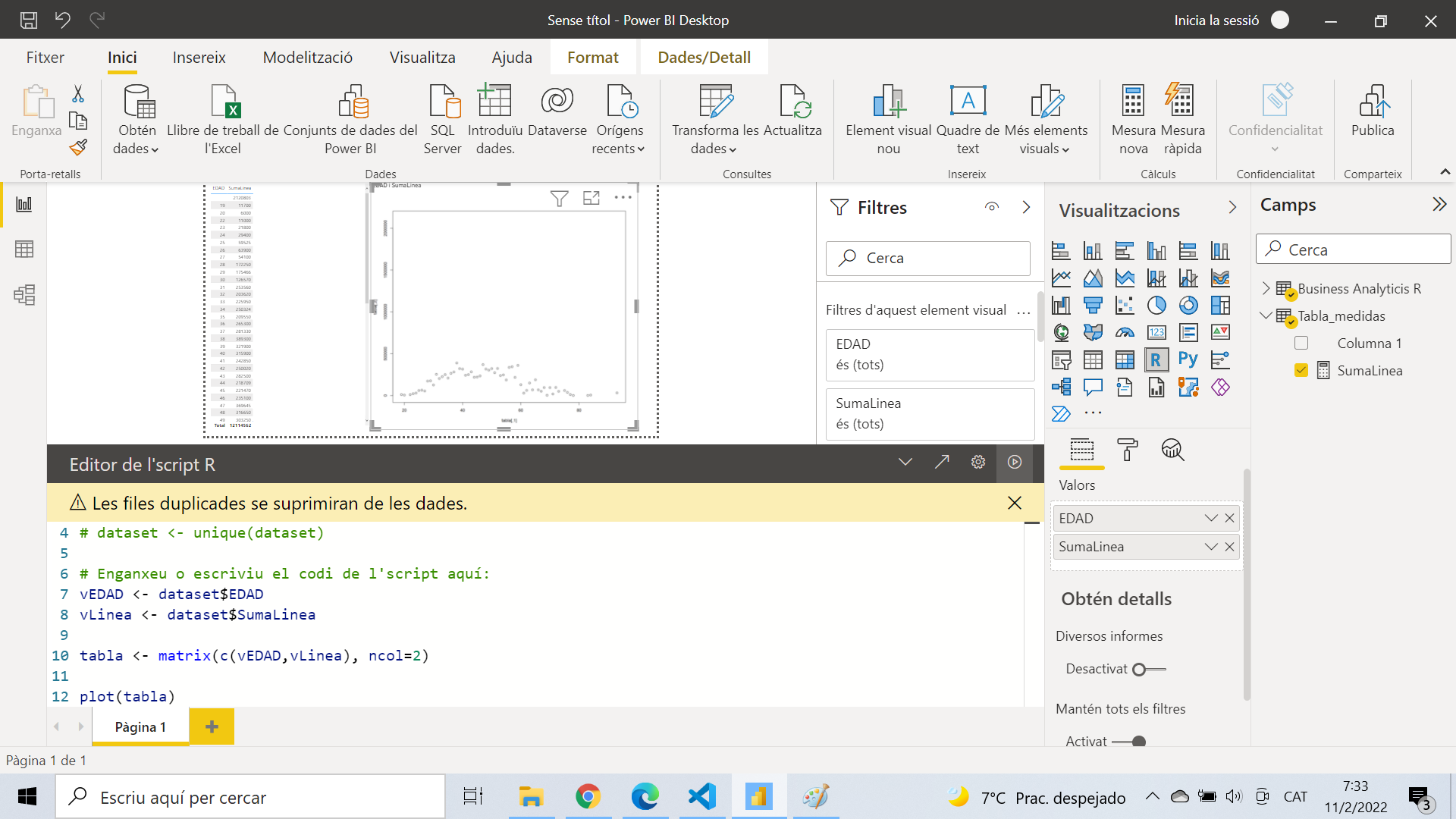
Data analytics with Python/R
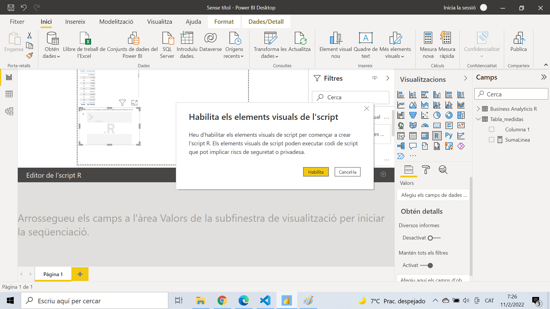
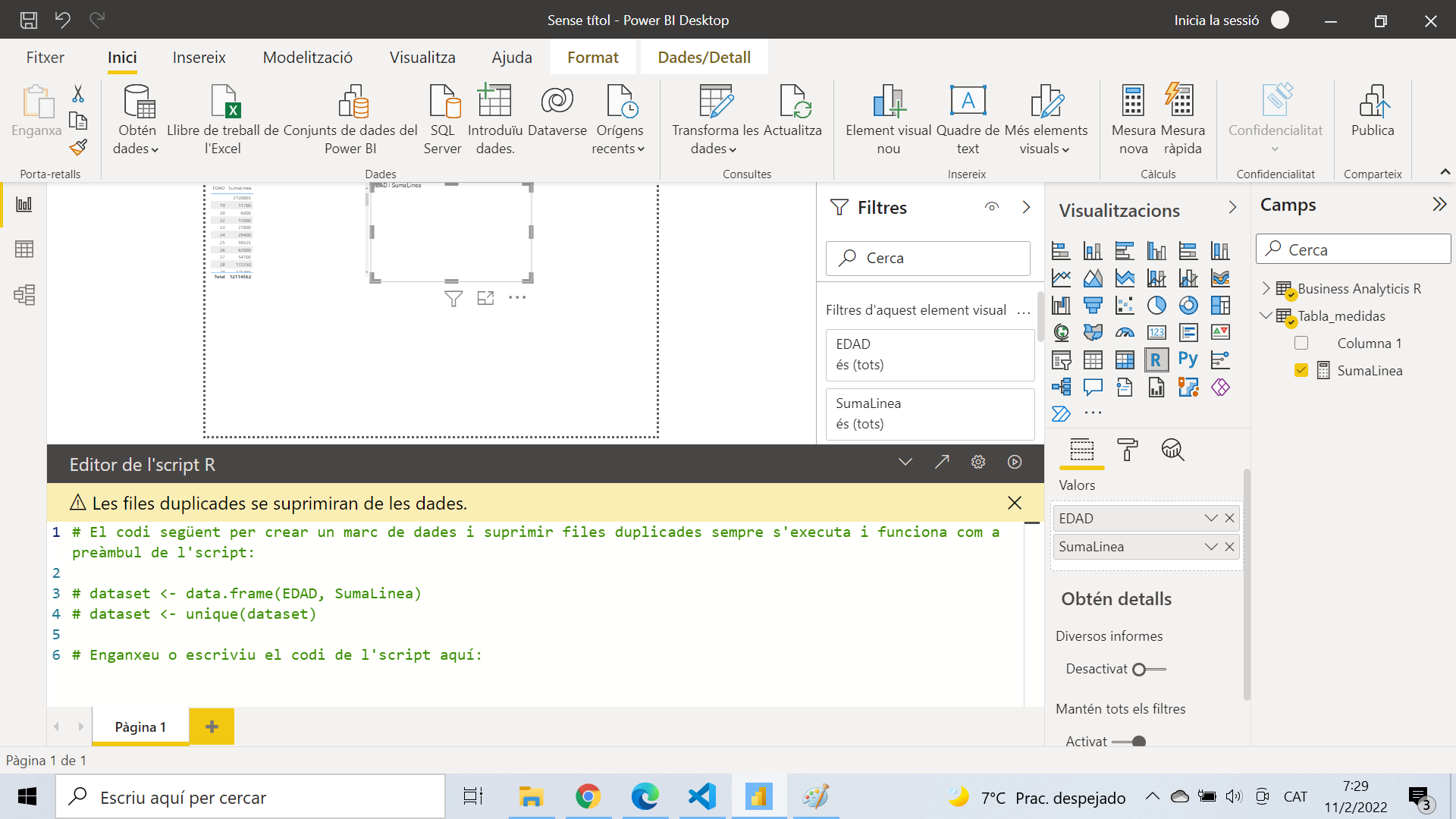
Power BI offers the possibility of integrating BI tools, with languages such as Python or R To make an example script in R, download and install R and R Studio
The URLs are available in the Recommended reading or tools section
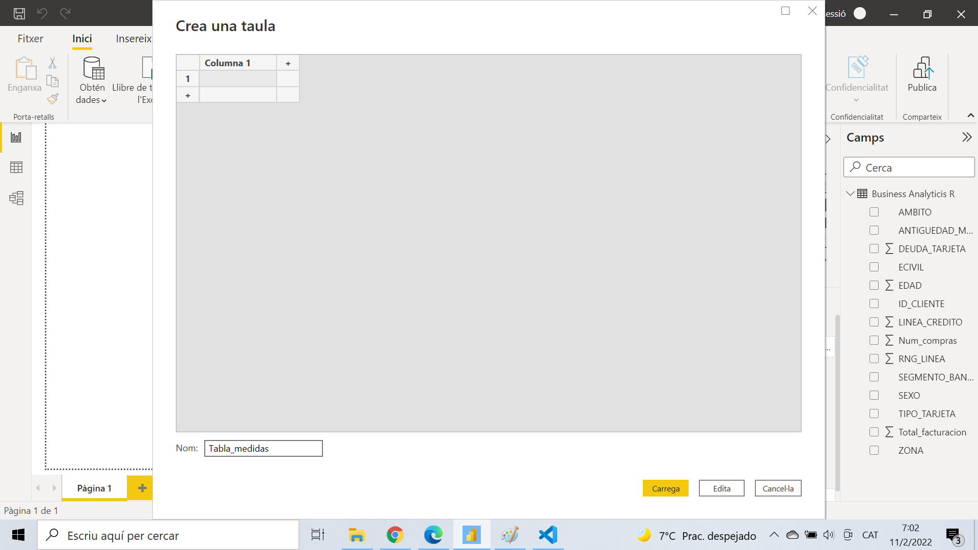
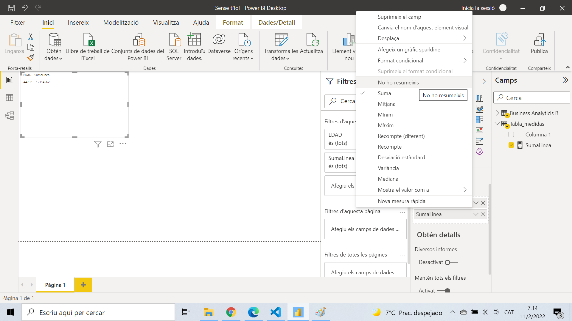
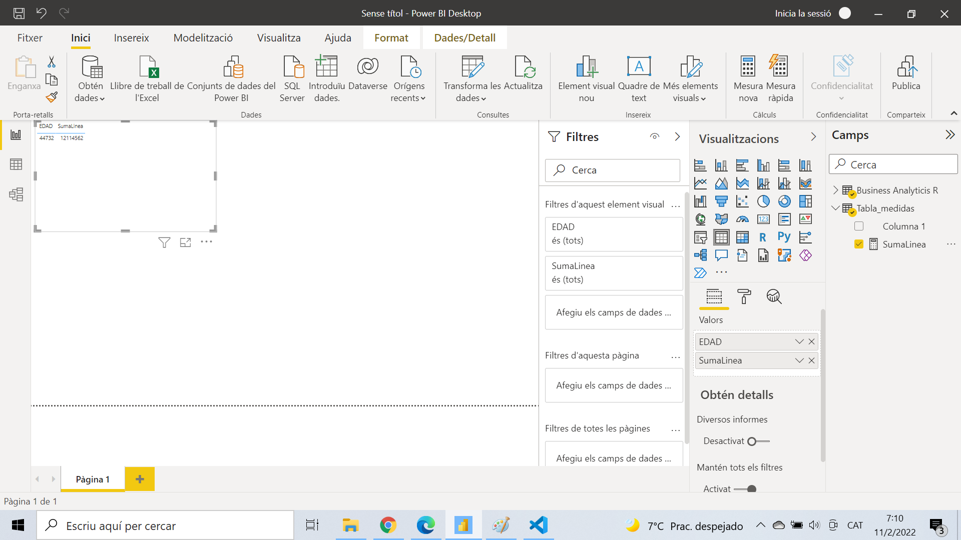
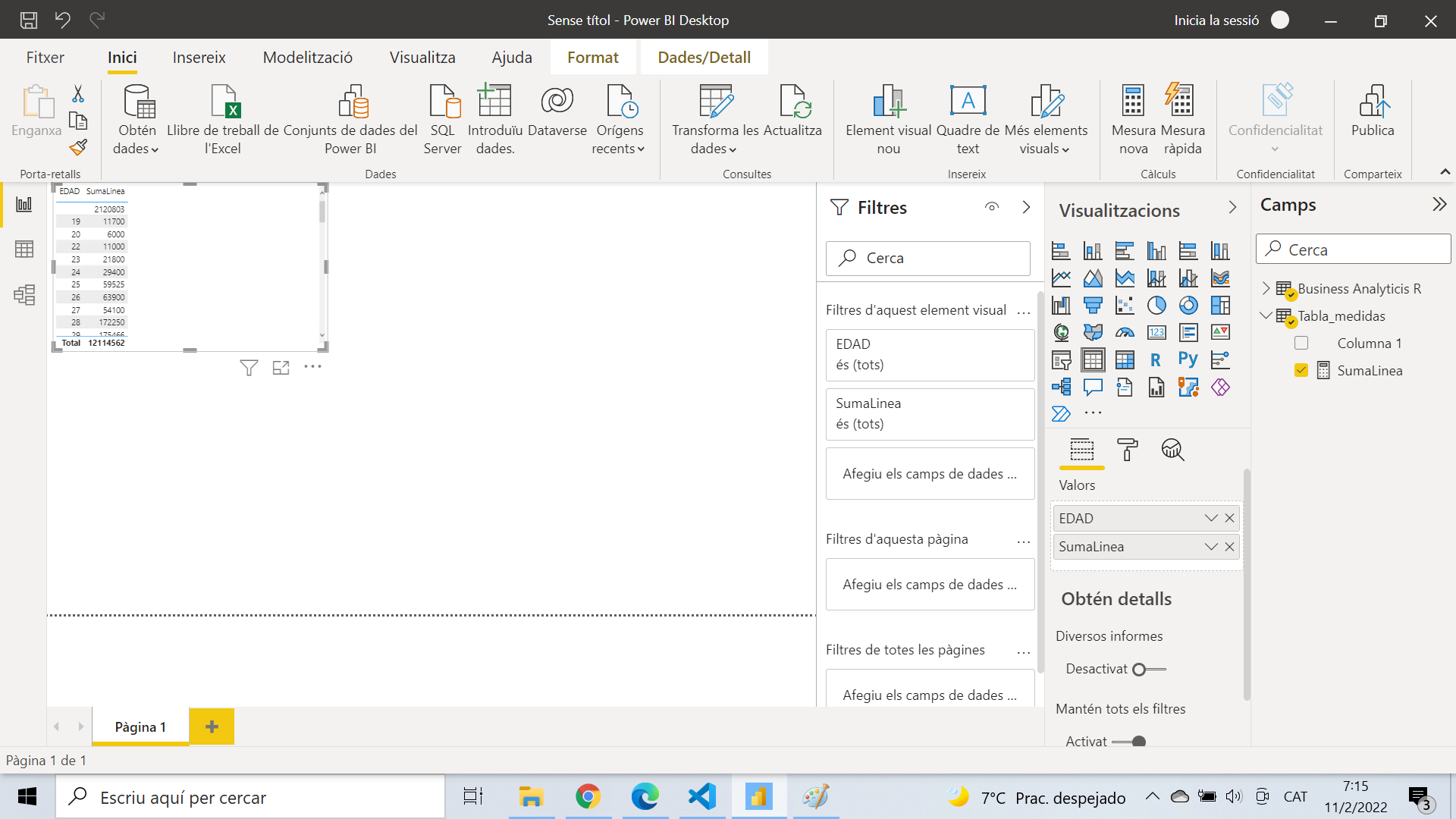
To check the measurement we create a table and see that it works OK
Now we will take these two variables to a graph made with R
Last updated