Data visualization
Data Storytelling
It allows us to make users develop in a more dynamic way with our reports
It helps us capture the user's attention and he himself discovers new information through interactions
Create visualizations
Choosing the correct visualization is one of the most important parts of our project: Communicating our ideas or discoveries to a larger audience in a dynamic way
Less is more
Colors are important, use them well
Keep your elements well aligned
Be consistent
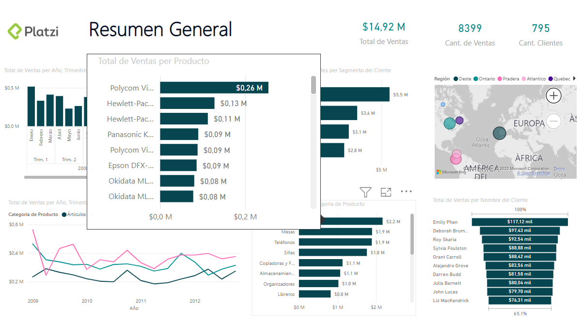
Isn't always good to show a whole figure
Show only related information
A bad choice of a visual can cause the information to not be transmitted correctly
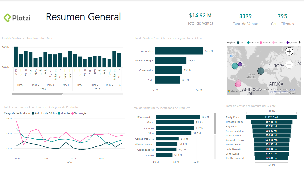
Create a report with Power BI
What is a report?
It's the collection of pages segmented by a particular theme and offers a summarized and interactive view with the ability to filter according to the user's needs
Data Storytelling with Power BI
Bookmarks: They save the configuration of the current view of the report
Buttons: Allows to activate an action of our report
Advanced tooltips: Allows to show additional detail to our visualizations
Last updated